Over the course of an enriching eight-year tenure, I served the Nudie Jeans website as a digital custodian.
This extensive role spanned a spectrum of tasks, from crafting seamless user experiences — ranging from the creation of entire mini-sites for upcoming campaigns to the meticulous refinement of pivotal components like the buy button — to the continuous vigilance in upholding high levels of accessibility, ensuring all users could navigate the platform with ease.
On any given day, my responsibilities could encompass constructing new data models within Contentful for upcoming content features, to developing and testing those features and finally deploying them to the live production environment. This was done in close collaboration with Nudie Jeans’s talented designers and project managers to ensure consistency in design expression and keeping the project on track and on budget, all while fulfilling cross-device and cross-platform compatibility.
I cherished the continued polishing of the site, even when it was just fixing the occasional typo or peculiar iPad landscape visual inconsistency here and there.
I approached my work with a sense of ownership and love, treating it as if it were my own.
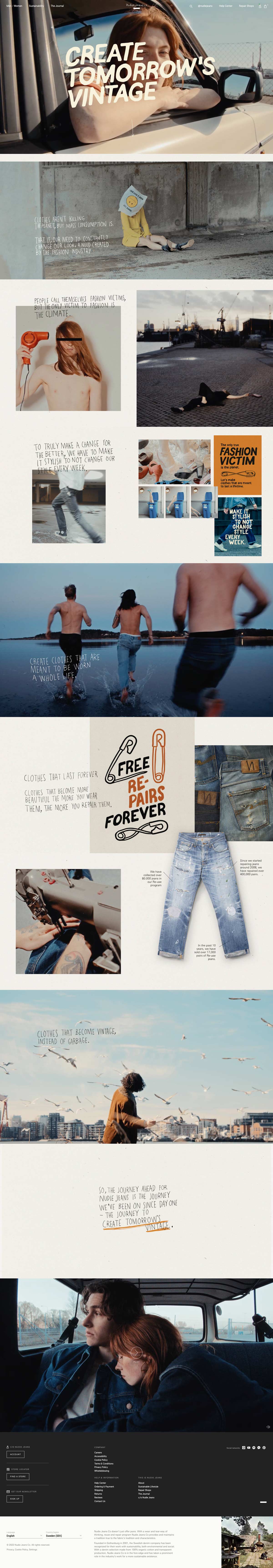
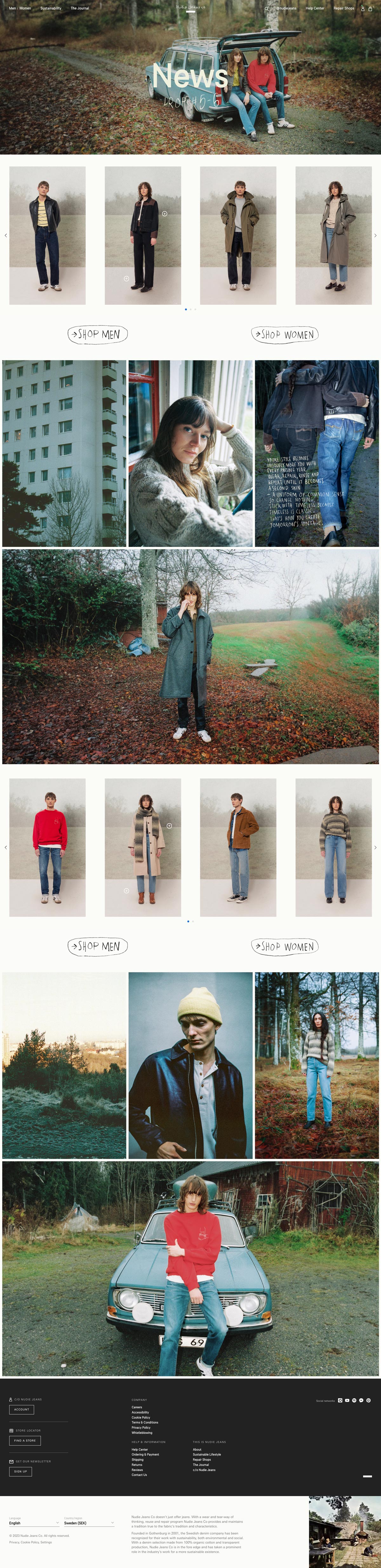
The Nudie Jeans website presented a unique blend of challenges and rewards, encapsulating the quintessence of a fulfilling project. It provided an exceptional opportunity to work with a visionary client, one with a clear strategic direction, who consistently aimed to be at the forefront of the ever-evolving technical landscape.
Throughout my time, this website held a special place in my heart. I approached my work with a sense of ownership and love, treating it as if it were my own.